
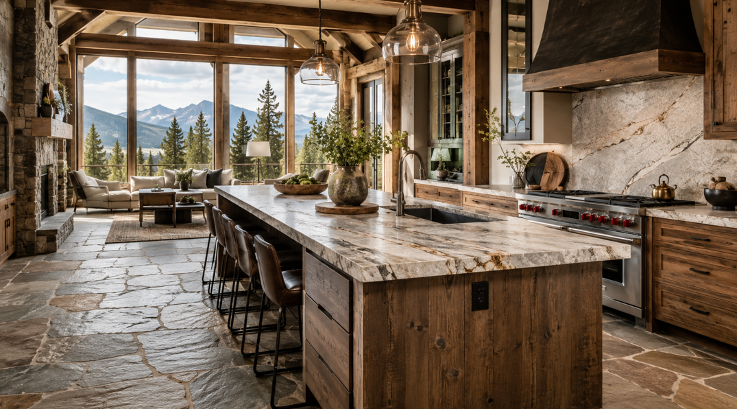
Start With the Stone Underfoot
Natural stone flooring gives a Montana home a strong sense of place. Slate can feel rugged and grounded, travertine brings warmth and movement, and granite or limestone can create a more refined mountain look. Because stone has so much natural variation, the countertop needs to support it rather than compete for attention.
The simplest design rule is this: choose one dominant surface and one supporting surface. When the flooring has bold veining, varied color, or a heavily textured finish, a quieter countertop usually creates better balance. When the floor is calm and consistent, the countertop can carry more pattern or contrast.
This approach works especially well in open-plan homes, where flooring may continue through a kitchen, dining area, entry, or living space. The countertop becomes part of a larger visual story instead of an isolated design decision.
At Missoula Floors, homeowners can coordinate cabinetry, flooring, countertops, and other interior finishes with help from a knowledgeable local team. That matters because samples that look attractive on their own can behave very differently once they sit beside real stone, cabinet colors, wall finishes, and Montana’s changing natural light.
Before choosing a slab or surface, identify three qualities in the floor:
Its main background color
Its strongest secondary tone
Its level of pattern and movement
Those details provide a practical foundation for every decision that follows.
Read the Undertones Before Matching Colors
Two materials can both be described as beige, gray, brown, or white and still look disconnected. The reason is usually the undertone.
Warm Stone Undertones
Warm natural stone may include cream, tan, gold, rust, taupe, red, or soft brown. Travertine, some limestones, and many slate varieties fall into this group.
Countertops that often coordinate well include:
Warm white quartz
Cream quartzite
Beige granite with subtle movement
Soft taupe surfaces
Soapstone with warm cabinetry
Light brown or greige patterns
The goal is not to copy every color in the floor. Instead, choose a countertop with one undertone that already appears naturally in the stone.
For example, a travertine floor with cream, honey, and muted brown movement may pair more naturally with a warm white quartz than with a bright, blue-toned white. The countertops do not need to repeat every variation in the floor. One shared undertone is enough to establish a connection.
Cool Stone Undertones
Cool stone commonly shows blue-gray, charcoal, silver, green-gray, or crisp white. Certain slates, marbles, granites, and dark limestones can create this effect.
Suitable countertop directions may include:
Crisp or soft white quartz
Charcoal soapstone
Blue-gray granite
Cool white quartzite
Pale gray surfaces with restrained veining
Black countertops for deliberate contrast
A charcoal slate floor, for instance, can look clean and balanced beside a soft white countertop with fine gray veining. The lighter surface brightens the room while still relating to the floor’s cooler colors.
Mixed Undertones
Some stone floors contain both warm and cool colors. This is common in multicolor slate and heavily varied granite tile.
In that situation, use a bridge color. Greige, mushroom, soft taupe, and warm gray can connect the two sides without making the room feel patchy. Cabinet color can also serve as the bridge, particularly when the flooring and countertop are both visually active.
Do not rely on a product name alone. “Arctic,” “sand,” “pearl,” or “smoke” may sound helpful, but the real sample is what matters. Place it directly against the flooring and view the pairing during morning, afternoon, and evening light.
Balance Pattern, Movement, and Texture
Natural stone flooring already has visual depth. Veining, mineral deposits, cleft surfaces, fossils, color shifts, and irregular edges all add character. A countertop with equal movement can make the room feel busy, especially when cabinetry, backsplash tile, and hardware are added.
When the Floor Is Bold
Choose a countertop with:
A simple background
Fine or widely spaced veining
Low color variation
A consistent finish
One clear connection to the floor’s undertone
For example, multicolor slate flooring may look best with a warm white or soft greige countertop rather than a heavily patterned granite containing several unrelated colors.
This does not mean the countertop needs to be plain. Subtle veining or fine mineral detail can add interest without competing with the flooring. The important distinction is visual hierarchy. The floor remains the expressive natural surface, while the countertop provides a calmer work area.
When the Floor Is Quiet
A calm limestone or evenly colored stone tile gives the countertop more freedom. Homeowners can consider expressive quartzite, veined quartz, granite, or marble-look surfaces without overwhelming the room.
Even then, repeat at least one color from the floor. A dramatic countertop feels intentional when its background or veining connects to the stone below.
A pale limestone floor, for example, might support quartzite with sweeping gray and warm beige movement. The floor acts as a quiet foundation, allowing the countertop to become the room’s focal surface.
Consider Surface Texture
Texture affects the pairing as much as color. A heavily cleft slate floor has a rustic, tactile appearance. A highly polished countertop can create appealing contrast, while a honed surface may produce a softer and more cohesive result.
Think about the overall mood:
Polished countertops reflect more light and can make rustic stone feel more refined.
Honed countertops reduce glare and suit relaxed mountain-modern interiors.
Leathered granite adds subtle texture without copying the floor exactly.
Matte quartz can provide a calm counterpoint to stone with strong movement.
Avoid matching rough flooring with an equally rough work surface simply for consistency. Countertops also need to feel comfortable and practical for daily cooking, cleaning, and entertaining.
Pair Popular Countertop Materials With Natural Stone Floors
The right material depends on the appearance homeowners want, the level of maintenance they are comfortable with, and how the space will be used.
Quartz With Natural Stone Flooring
Quartz is a practical option when the floor already carries a lot of natural variation. Its more controlled pattern can bring visual order to a kitchen or bathroom.
Quartz works especially well when homeowners want:
A consistent background color
A low-maintenance surface
Subtle veining
A cleaner mountain-modern look
Easier coordination across a large kitchen
Warm white quartz can soften dark slate, while pale greige quartz can connect cream limestone with medium wood cabinetry. In a room with dramatic stone flooring, choose restrained veining rather than a pattern that tries to imitate every line in the floor.
Quartz can also help brighten a kitchen where dark natural stone covers a large area. A light countertop reflects more light and creates contrast without requiring bright white cabinetry.
Granite With Natural Stone Flooring
Granite can create a rich, natural-material palette, but the two stones need breathing room. If both surfaces contain strong movement, use cabinetry or a simple backsplash to separate them visually.
Granite often works best when:
Its dominant background relates to the floor
Its secondary colors connect with the cabinets or hardware
Its pattern is quieter than the flooring
The room is large enough to support multiple natural surfaces
A dark, nearly solid granite can look striking above warm limestone or travertine. A light granite with gentle mineral detail can brighten charcoal slate.
When reviewing granite, look at the full slab whenever possible. A small sample may not show large areas of movement, concentrated mineral deposits, or changes in background color.
Quartzite With Natural Stone Flooring
Quartzite offers the natural variation many homeowners love while often appearing lighter and more fluid than heavily patterned granite. It can be an excellent focal surface when the flooring is fairly quiet.
Use quartzite thoughtfully with multicolor slate. A slab with broad, dramatic veining may compete with the floor, while a softer cream or gray quartzite can create a more balanced result.
Quartzite can also work well with natural wood cabinets because its movement often contains several related neutral tones. Those colors can help link the cabinets, floor, and countertop without requiring an exact match.
Soapstone With Natural Stone Flooring
Soapstone’s deep color and soft movement suit cabins, historic homes, rustic kitchens, and mountain-modern spaces. It pairs naturally with slate, flagstone-inspired floors, and warm wood cabinetry.
Because soapstone typically darkens over time and develops character with use, homeowners need to appreciate a lived-in appearance. Its visual simplicity can help calm a floor with varied color.
Soapstone can also provide a strong contrast against pale limestone, cream travertine, or light natural wood. The combination feels grounded without relying on a highly patterned countertop.
Porcelain and Other Manufactured Surfaces
Large-format porcelain and other engineered surfaces can reproduce stone-inspired looks with more pattern control. They may be useful when the goal is a thin profile, a specific color, or a highly consistent design.
The key is avoiding an obvious near-match. A manufactured marble look beside rustic slate can work beautifully when the contrast is deliberate. A printed stone pattern that almost matches the floor but misses the undertone can feel less convincing.
Homeowners exploring countertops can compare full samples beside their flooring, cabinetry, and paint selections before making a final decision.
Coordinate the Countertop With Cabinets and Backsplash
The floor and countertop are only two parts of the room. Cabinets and backsplash materials determine whether the full palette feels connected or crowded.
Use Cabinets as a Visual Bridge
Cabinet color can unite surfaces that are not an exact match.
Natural wood cabinets are especially effective in Montana homes because wood often contains both warm and neutral tones. White oak, alder, maple, hickory, and walnut can bridge the visual space between stone flooring and a lighter or darker countertop.
Painted cabinets can do the same job:
Warm white connects cream stone with beige or taupe counters.
Greige works with mixed warm and cool flooring.
Deep green complements slate, soapstone, and warm natural wood.
Charcoal creates a refined look with pale limestone and light countertops.
Soft blue-gray can support cool slate without making the room feel cold.
Think of the cabinets as the material that separates the floor and countertop. Because the two stone surfaces do not sit directly against each other across most of the room, the cabinet finish has a major influence on how connected they appear.
Keep the Backsplash in a Supporting Role
When the floor and countertop both contain visible movement, the backsplash usually works best as a quieter surface.
Consider:
Simple ceramic tile
Handmade-look tile in one soft color
A countertop-height backsplash using the same slab
Matte subway tile
Small amounts of natural stone with restrained variation
Avoid introducing a third bold stone pattern unless the room is large and the palette has been reviewed carefully. More materials do not automatically create more depth.
A simple backsplash also provides flexibility. Cabinet hardware, paint colors, lighting, and accessories can change over time without clashing with a highly specific tile pattern.
Repeat Finishes With Intention
Hardware and fixtures can reinforce the material pairing. Matte black can connect dark slate with a pale countertop. Brushed brass can highlight warm mineral tones. Brushed nickel can support cool gray stone without dominating the design.
Two or three repeated finishes are usually enough. A room that includes several woods, multiple stones, patterned tile, mixed metals, and contrasting paint colors may lose the calm quality many homeowners want from a mountain-inspired interior.
Make the Pairing Work in Montana Light
Light changes how stone and countertop samples appear. Western Montana homes can receive bright high-elevation sun, deep winter shadows, and strong seasonal shifts. Large windows may intensify color differences that seemed minor in a showroom.
Check Samples at Different Times
View samples:
In direct morning light
Under afternoon sun
On an overcast day
Under the room’s evening lighting
Beside the actual cabinets and wall color
Warm artificial light can make cream stone look more golden. Cool LED lighting can bring out blue or green undertones in slate and gray countertops. A pairing that looks balanced at noon may feel disconnected after sunset.
Leave the samples in the room for several days rather than making a decision during one short viewing. Natural stone can look noticeably different as the weather and light change.
Consider Room Orientation
South- and west-facing rooms often receive stronger, warmer light. Dark counters may show more reflective contrast, while warm stone may appear richer.
North-facing rooms tend to receive cooler, softer light. Cream, taupe, and warm white counters can prevent gray stone flooring from feeling flat or cold.
Rooms with limited windows may benefit from lighter countertops, reflective finishes, or warm cabinet colors. A dark countertop can still work, but the lighting plan needs to support it.
Think About Open-Plan Sightlines
In an open floor plan, stand in the adjoining room and look back toward the kitchen. The countertop may be seen from the living area, entry, or dining space, so it needs to coordinate with more than the floor immediately below it.
Take photographs of the samples together from several distances. Close-up details matter, but the room’s overall balance is usually easier to judge from ten or fifteen feet away.
Avoid Common Pairing Mistakes
A few design missteps appear repeatedly when natural stone floors and countertops are chosen separately.
Trying to Match the Stone Exactly
An exact match is rarely necessary and can be almost impossible with natural materials. Variation between tiles, slabs, batches, and lighting conditions means two “matching” products may still look slightly off.
Aim for coordination rather than duplication. Related undertones usually create a more natural result than two surfaces that appear to be competing as near-matches.
Choosing From a Small Sample Alone
A small sample may not reveal the full veining, color range, or movement of a countertop slab. Review the largest sample available and, for natural stone, inspect the actual slab whenever possible.
It also helps to photograph the flooring in the home and bring those photos to the showroom. Include close-up images and wider views that show the floor beside cabinets, walls, and nearby rooms.
Adding Too Many Competing Patterns
Bold flooring, dramatic countertops, patterned backsplash tile, visible wood grain, and high-contrast cabinets can all be attractive individually. Together, they may create visual noise.
Choose one focal material and let the others support it. A room can still have depth through texture, finish, and subtle color variation.
Ignoring Finish and Sheen
A glossy counter beside matte stone can feel elegant, but the contrast needs to be intentional. When every surface has a different sheen, the room may feel disconnected.
Compare finishes under the actual lighting. Polished surfaces can reflect windows, pendants, and under-cabinet lighting, while honed and matte finishes absorb more light.
Forgetting Practical Use
A beautiful pairing still needs to suit the household. Consider cleaning habits, cooking frequency, pets, children, entertaining, and the amount of natural wear the space receives.
Color and pattern can help disguise crumbs, water spots, dust, and everyday marks. Very dark polished counters may show fingerprints more readily, while highly varied stone can hide debris until cleaning time.
A Simple Selection Process
Use this step-by-step approach to narrow the options without making the project feel overwhelming.
1. Identify the Floor’s Dominant Traits
Write down the floor’s background color, undertone, pattern level, texture, and finish. Do not focus only on the most dramatic vein or tile. Look at the overall impression across the room.
2. Decide Which Surface Will Lead
Choose whether the floor or countertop will be the visual focal point. In most existing homes, the installed flooring naturally takes the lead.
For a new build or complete remodel, either surface can lead. Make that decision early so the design does not end up with two competing focal points.
3. Select Two or Three Countertop Directions
Compare a light neutral, a medium bridge color, and a deliberate dark contrast. This keeps the decision focused while still showing meaningful options.
Eliminate any sample that introduces an unrelated undertone, even when the surface looks beautiful on its own.
4. Add the Cabinet Sample
A countertop that looks wrong beside the floor may work once the cabinet color connects them. Review all three materials together before ruling out an option.
5. Test the Backsplash Last
The backsplash needs to respond to the final floor, countertop, and cabinet combination. Choosing it too early can limit the rest of the palette.
6. Review the Materials in the Home
Leave samples in place for several days. Look at them during different weather and lighting conditions, then view them from the adjoining spaces.
7. Confirm Maintenance Expectations
Ask how each material handles sealing, heat, scratches, stains, cleaning products, and normal wear. Select the surface based on the household’s real routine, not only the showroom appearance.
Create a Connected Montana Interior
Pairing countertops with natural stone flooring is less about finding an exact match and more about creating balance. Start with undertones, decide which surface will lead, control the amount of pattern, and use cabinetry as a visual bridge.
A bold slate floor often benefits from a quieter countertop. A calm limestone or travertine floor can support more movement above. Quartz can introduce consistency, granite and quartzite can add natural depth, and soapstone can bring understated character to rustic or mountain-modern rooms.
The most successful combinations also respond to the whole home. Lighting, cabinet color, backsplash, hardware, room size, and open-plan sightlines all influence how the materials feel together.
Missoula Floors offers in-house design guidance, quality products, free in-home estimates, and local experience for homeowners in Missoula, Polson, Superior, Stevensville, Hamilton, and surrounding areas. Ready to compare materials for your kitchen, bathroom, or remodel? Get in touch with the team for personalized help creating a coordinated interior.