
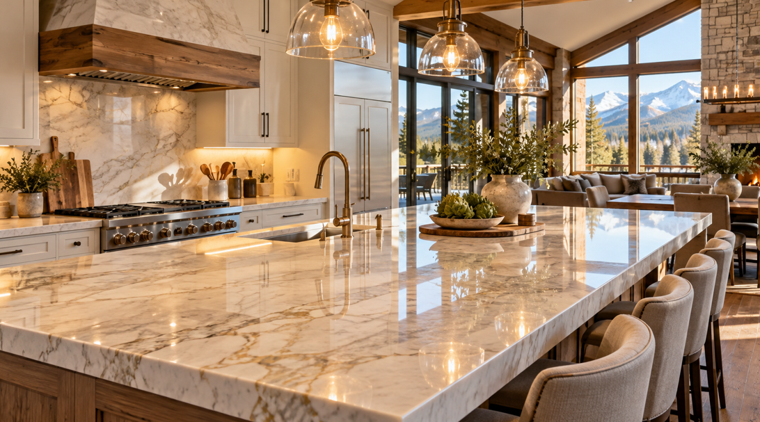
Countertops can completely change how bright, warm, open, or dramatic a kitchen or bathroom feels. Color usually gets most of the attention, but the way a countertop interacts with light can be just as important.
A surface that looks perfect under bright showroom lighting may feel very different once it is installed in a Montana home with large windows, shaded rooms, warm evening lighting, or a mix of natural and artificial light throughout the day.
For homeowners across Missoula, Polson, Superior, Stevensville, Hamilton, and other parts of Western Montana, choosing a countertop is therefore about more than finding an attractive pattern. It helps to consider the direction of the light, the amount of sunlight the room receives, the color temperature of indoor lighting, surrounding cabinets, flooring, and how reflective the countertop finish appears.
At Missoula Floors, homeowners can explore interior materials with the complete room in mind rather than selecting each surface separately.
The right countertop can help brighten a darker kitchen, soften a very sunny room, make warm artificial lighting feel more inviting, or add contrast to a space that otherwise feels flat.
Start by Understanding the Light Already in Your Room
Before comparing countertop colors, look carefully at how the room behaves throughout the day.
A kitchen that feels bright at 10 a.m. may become noticeably darker in the afternoon. A bathroom with limited natural light may rely almost entirely on ceiling fixtures and vanity lighting.
Notice How Much Natural Light You Receive
Rooms with generous windows usually give homeowners more flexibility with countertop color.
Bright spaces can often accommodate:
Darker countertop tones
Rich veining
Matte or honed finishes
Strong contrasts
More dramatic stone patterns
Rooms with limited natural light may benefit from lighter surfaces that help distribute available brightness visually.
That can include:
Soft white
Warm cream
Light beige
Pale gray
Subtle stone patterns
The goal is not always to make the room as bright as possible. Instead, the countertop can help create the amount of light and contrast that feels comfortable.
Observe the Room at Different Times
Natural light changes constantly.
Morning light may appear cooler and softer. Afternoon sunlight can become stronger and warmer. During Montana winters, the room may depend more heavily on artificial lighting for longer parts of the day.
Look at your potential countertop samples:
In the morning
Around midday
Late in the afternoon
After sunset with your regular lights switched on
Seeing the same sample under several conditions gives you a much better sense of how it will actually look once installed.
Consider Which Direction Your Windows Face
Window orientation can affect both the intensity and color of natural light.
You do not need to become an expert in lighting design, but understanding the general effect can make countertop selection easier.
North-Facing Rooms
North-facing rooms often receive softer, more indirect natural light.
In these spaces, very cool gray countertops can sometimes make the room feel flatter or colder, especially when combined with cool-colored cabinetry.
Warmer countertop options may create a more welcoming balance.
Consider surfaces featuring:
Cream
Warm white
Beige
Soft taupe
Warm gray
Subtle gold or brown veining
These colors can add warmth without making the room visually heavy.
South-Facing Rooms
South-facing rooms generally receive stronger natural light during much of the day.
That extra brightness gives homeowners more freedom to experiment.
You may be able to use:
Charcoal
Deep gray
Rich brown
Dramatic veining
High-contrast patterns
Darker stone-inspired surfaces
A lighter countertop can still work beautifully, but it is not always necessary to rely on pale colors to keep the room bright.
East-Facing Rooms
East-facing kitchens and bathrooms are often brightest in the morning.
If the room becomes more shaded later, a countertop that maintains some visual brightness can help the space feel balanced throughout the day.
Mid-tone surfaces with gentle contrast often work particularly well.
West-Facing Rooms
West-facing spaces may become significantly brighter later in the day.
Warm afternoon light can intensify cream, beige, brown, and gold undertones.
When evaluating samples, check them during the strongest afternoon light so you know whether those warmer tones remain comfortable rather than becoming overly dominant.
Light Countertops Can Help a Darker Room Feel More Open
One of the most reliable ways to visually brighten a room is to choose a lighter countertop.
White and off-white surfaces can reflect more available light than darker materials, helping the room feel open even when windows are limited.
However, pure bright white is not the only option.
Warm White
Warm white countertops can work well in homes that use:
Natural wood cabinetry
Cream walls
Beige flooring
Brass or bronze hardware
Warm artificial lighting
The subtle warmth keeps the surface from feeling stark.
Soft Gray
Light gray provides a slightly cooler alternative while still maintaining brightness.
It can work especially well with:
White cabinets
Black hardware
Blue-gray cabinetry
Modern flooring
Stainless steel appliances
Light Beige and Cream
These surfaces are particularly useful in mountain-modern interiors because they complement wood, stone, and earthy colors naturally.
They can brighten the room while creating a softer effect than crisp white.
The most important thing is to view light countertop samples next to the other finishes in the room. A surface can appear white on its own but unexpectedly cream, gray, or pink beside a cabinet door or floor sample.
Dark Countertops Can Work Beautifully in Bright Montana Homes
Dark countertops sometimes get dismissed because homeowners worry they will make the room feel smaller.
In a well-lit space, however, darker surfaces can create some of the most striking designs.
Large windows, open layouts, light cabinets, and strong overhead lighting can provide enough brightness to support darker counters comfortably.
Create Contrast With Light Cabinets
Dark gray, charcoal, black, or deep brown countertops can provide definition against white or pale wood cabinetry.
The contrast helps separate the surfaces visually and can make both finishes stand out.
Use Dark Surfaces to Ground a Very Bright Room
A room with pale floors, light walls, light cabinetry, and extensive natural sunlight can sometimes feel washed out.
A darker countertop introduces visual weight.
Instead of competing with the brightness, it provides an anchor that helps the rest of the room feel balanced.
Watch the Finish
Highly polished dark countertops can reflect windows, ceiling fixtures, and bright points of light more noticeably.
Some homeowners enjoy that polished appearance. Others may prefer a softer finish that reduces reflections.
Looking at samples under both daylight and artificial lighting can help you decide which effect feels more comfortable.
Think About Countertop Finish as Well as Color
Color is only part of the lighting equation.
The surface finish changes how light behaves when it hits the countertop.
Polished Finishes
Polished surfaces tend to reflect more light.
They can:
Make colors look richer
Add visual brightness
Emphasize veining
Create a crisp, finished appearance
They may work particularly well in spaces where homeowners want a brighter or more refined look.
However, reflected light can also make glare more noticeable in rooms with strong direct sunlight or intense overhead lighting.
Honed or Matte Finishes
Honed and matte countertops diffuse light rather than reflecting it as strongly.
This can create a softer appearance.
They are often well suited to:
Mountain-modern interiors
Natural wood cabinetry
Relaxed kitchens
Earth-tone color palettes
Rooms with very bright natural sunlight
A matte surface can help keep a sunny space from feeling overly reflective while still providing visual depth.
Textured Finishes
Some countertop materials are available with more tactile or textured surfaces.
These can add character and work beautifully in rustic-modern designs, although the way light moves across the texture can make the surface appear different from various angles.
Always examine textured samples in the type of lighting you expect to use at home.
Coordinate Countertops With Cabinet Color
Countertops and cabinetry occupy a large amount of visual space, so they need to work together.
Instead of choosing the countertop separately, think about the contrast you want between the two surfaces.
Homeowners comparing finishes can explore available countertops while considering how each option reacts to their cabinet color, lighting, and surrounding finishes.
Light Cabinets With Light Countertops
This combination can make the room feel bright and open.
To prevent the design from appearing flat, use subtle contrast through:
Veining
Hardware
Backsplash texture
Flooring
Wood accents
For example, warm white cabinets paired with a lightly veined countertop can create visual interest without sacrificing brightness.
Light Cabinets With Dark Countertops
This creates stronger contrast.
It works particularly well when the room already receives plenty of daylight or has a strong artificial lighting plan.
The darker countertop defines the work surface while the lighter cabinets prevent the room from feeling visually heavy.
Dark Cabinets With Light Countertops
This is another effective contrast strategy.
Light countertops can help balance navy, charcoal, dark green, walnut, or deep brown cabinetry.
They also provide a bright surface at worktop level, where task lighting is especially important.
Wood Cabinets With Stone-Inspired Countertops
Natural wood cabinetry is especially well suited to Western Montana interiors.
Stone-inspired counters in cream, white, beige, gray, or softly veined patterns can keep the space feeling connected to natural materials without becoming overly rustic.
Pay Attention to Artificial Lighting at Night
Countertops should not only look good during the day.
During winter and evening hours, artificial lighting may become the main light source in the room.
The color temperature of those lights can significantly change how the countertop appears.
Warm Lighting
Warm bulbs tend to emphasize:
Cream
Beige
Brown
Gold
Warm wood tones
A countertop with subtle warm veining may become more noticeable under this type of lighting.
Cool gray surfaces, meanwhile, may appear slightly warmer than they do in daylight.
Cooler Lighting
Cooler artificial light can make whites look crisper and gray tones more prominent.
It may suit contemporary interiors, but homeowners using warm natural materials may prefer lighting that feels softer.
Under-Cabinet Lighting
Under-cabinet lights can strongly influence how the countertop appears because they shine directly onto the work surface.
Before choosing a countertop, consider whether your kitchen will use:
Warm LED lighting
Neutral white lighting
Brighter task lighting
Dimmable fixtures
The counter should look attractive under the lighting you actually plan to use rather than only under showroom fixtures.
Use Veining and Pattern to Work With the Light
Countertop pattern influences visual movement.
Large veins, speckles, fine lines, and dramatic contrasts all respond differently depending on the amount of light in the room.
Subtle Patterns for Low-Light Spaces
In darker rooms, very busy patterns can sometimes make the surface feel visually heavy.
A softer pattern can help maintain an open feeling.
Consider:
Fine veining
Gentle tonal changes
Light stone effects
Low-contrast patterns
Dramatic Veining for Bright Rooms
Rooms with generous natural light can often support stronger patterns.
Large-format veining can become a focal point, particularly on:
Islands
Long countertop runs
Waterfall edges
Large bathroom vanities
Strong natural light can reveal more of the surface variation throughout the day.
Remember That Samples Are Small
A countertop sample only shows a tiny portion of the full slab or finished surface.
If the material has noticeable veining or color variation, viewing a larger sample can give you a more accurate impression of the final design.
Match the Countertop to the Room's Purpose
Lighting needs vary between kitchens, bathrooms, and other countertop areas.
Kitchen Countertops
Kitchens usually require a mixture of general lighting and focused task lighting.
Countertops need to remain visually comfortable while working around:
Preparation areas
Islands
Sinks
Cooktops
Under-cabinet lighting
A surface with excessive glare may feel very different under task lights than it does from across the room.
Bathroom Countertops
Bathroom vanities are influenced heavily by mirror and vanity lighting.
A pale countertop can help maintain brightness, while a darker surface can add contrast to light walls and fixtures.
Consider how the counter looks next to:
Mirror lighting
Wall color
Cabinetry
Flooring
Shower tile
Home Bars and Entertainment Areas
These areas often use softer or more decorative lighting.
A countertop with deeper color or stronger movement can create a richer atmosphere without needing to maintain the same brightness as a primary kitchen.
Test Countertop Samples Before Making the Final Choice
One of the most useful steps is also one of the simplest: take samples into the actual room.
Showroom lighting can help you compare products, but your home has its own combination of window direction, wall colors, fixtures, flooring, and cabinetry.
Place countertop samples:
Near the window
Against the cabinet finish
Beside the flooring
Under ceiling lights
Under proposed task lighting
In shadowed corners
Then revisit them throughout the day.
Look at the Undertones
Many countertop colors contain subtle undertones that are easy to miss at first.
A white surface may lean:
Warm
Cool
Gray
Cream
Beige
A gray surface might contain blue, green, or brown undertones.
These subtle colors become more obvious when the countertop is placed beside cabinets and flooring.
Think About the Whole Room
Avoid choosing a countertop because it looks attractive by itself.
Instead, ask:
Does it complement the cabinets?
Does it work with the flooring?
Does the lighting make the color warmer or cooler?
Does the room have enough contrast?
Does the surface still appeal to me after sunset?
A countertop that works with the entire space will usually feel more intentional than one chosen in isolation.
Countertop and Lighting Ideas for Different Montana Home Styles
Mountain-Modern Homes
Consider combinations such as:
Natural wood cabinets
Light stone-inspired countertops
Matte black hardware
Warm neutral lighting
This keeps the space modern while maintaining warmth.
Rustic-Inspired Homes
Warmer surfaces often work particularly well.
Cream, beige, brown, and soft stone patterns can coordinate naturally with wood-heavy interiors.
Contemporary Homes
High contrast can be very effective.
Examples include:
White cabinets with charcoal countertops
Dark cabinets with pale quartz
Light counters with black fixtures
Clean gray surfaces with strong task lighting
Smaller Homes and Cabins
For compact spaces, lighter countertops can help preserve an open appearance.
Keeping the countertop pattern relatively simple can also prevent smaller rooms from feeling visually busy.
Create the Right Balance of Light, Color, and Material
The best countertop for your Montana home is not necessarily the brightest, darkest, or most reflective option. It is the surface that works with the light already present in the room and supports the atmosphere you want to create.
Lighter countertops can help brighten rooms with limited natural light. Darker surfaces can add depth and contrast to spaces with generous windows. Polished finishes reflect more light, while matte or honed finishes create a softer effect.
Cabinetry, flooring, wall colors, lighting temperature, and countertop pattern all influence the final result, which is why evaluating these elements together is so valuable.
Before making a final selection, view samples during different times of day and under the artificial lighting you expect to use regularly.
Missoula Floors can help homeowners throughout Western Montana coordinate countertops with cabinetry, flooring, and the broader design of their space.
Ready to find a countertop that works beautifully with the light in your home? Reach out to us to explore options for your kitchen, bathroom, or next remodeling project.