
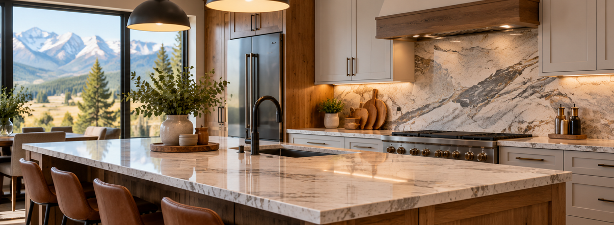
Countertops and backsplashes take up some of the most visible space in a kitchen, which means the way they work together can shape the entire room.
A beautiful countertop can lose some of its impact when paired with a backsplash that competes for attention. On the other hand, even a simple backsplash can make the countertop stand out when the colors, textures, and patterns feel balanced.
That matters in Montana homes, where kitchens often blend natural materials, warm wood tones, stone-inspired surfaces, mountain-modern details, and practical finishes designed for everyday living.
Whether you are remodeling a kitchen in Missoula, Polson, Superior, Stevensville, Hamilton, or elsewhere in Western Montana, it helps to think of countertops and backsplashes as a coordinated design decision rather than two separate selections.
At Missoula Floors, homeowners can explore materials and finishes that work together across countertops, cabinetry, flooring, and other parts of the room.
The best pairing does not necessarily mean matching everything perfectly. In many cases, the strongest designs come from creating the right balance between contrast and coordination.
Start With the Countertop
The countertop usually covers more visual space than the backsplash and plays a larger role in daily use, so it often makes sense to choose it first.
Once the countertop is selected, the backsplash can be used to support, soften, or contrast with it.
Pay Attention to the Dominant Color
Look at the overall color of the countertop before focusing on smaller details.
A countertop may read primarily as:
White
Cream
Beige
Gray
Brown
Black
Charcoal
Warm stone
Cool stone
This dominant color gives you a starting point for choosing backsplash tones.
A white countertop with soft gray veining, for example, may work well with white, light gray, soft beige, or muted stone tile. A warm beige surface might pair more naturally with cream, sand, taupe, or earthy backsplash colors.
Notice the Veining and Pattern
Some countertops have very subtle movement, while others feature bold veining, dramatic contrast, or noticeable speckling.
The busier the countertop pattern, the more carefully the backsplash needs to be selected.
When both surfaces contain strong patterns, the kitchen can begin to feel visually crowded.
Think About Finish
A polished countertop reflects more light, while honed or matte surfaces create a softer look.
The backsplash finish can either reinforce that effect or create contrast.
For example:
Polished countertop + matte tile = balanced contrast
Matte countertop + glossy tile = added brightness
Polished countertop + polished backsplash = more reflective and dramatic
There is no single correct formula. The combination simply needs to feel intentional.
White Countertops With White Subway Tile
This is one of the most reliable countertop and backsplash combinations because it creates a clean, adaptable foundation.
Why It Works
White countertops naturally help brighten a kitchen.
Pairing them with white subway tile keeps the palette simple while allowing other materials to provide warmth and contrast.
This combination works especially well with:
Natural wood cabinets
White cabinets
Navy cabinets
Green cabinets
Black hardware
Brushed nickel
Warm brass
Wood-look flooring
The key is to avoid making every surface look identical.
Add Interest Through Texture
If both the countertop and backsplash are white, use texture to prevent the room from feeling flat.
Consider:
Handmade-look subway tile
Slightly irregular edges
Matte finishes
Glossy tile with subtle variation
Contrasting grout
Vertical tile layouts
A white backsplash can remain simple without becoming plain.
Best Fit for Montana Homes
This pairing works particularly well in mountain-modern kitchens where homeowners want clean lines but still plan to incorporate natural wood, warm flooring, or darker accents.
It also works well in smaller kitchens because the light surfaces can help the room feel brighter and less visually heavy.
White Countertops With Warm Beige or Cream Backsplash
Not every white countertop needs to be paired with another white surface.
Warm beige and cream backsplashes can soften the room and create a more inviting feel.
Why It Works
This pairing is especially effective when the countertop has subtle warm veining.
A cream or beige backsplash can pick up those undertones and connect the countertop with:
Oak cabinets
Walnut-inspired cabinetry
Warm flooring
Brass hardware
Earth-tone walls
The result can feel polished without becoming overly modern.
Keep the Undertones Consistent
Warm white countertops can sometimes look slightly yellow or creamy next to a cool gray backsplash.
That is why it helps to compare samples side by side.
Look for shared undertones rather than exact color matches.
Where This Pairing Works Best
This combination is a strong fit for kitchens with:
Natural wood cabinetry
Rustic-modern details
Mountain-inspired interiors
Warm lighting
Earth-tone flooring
It gives homeowners a softer alternative to the sharper contrast of white and gray.
Dramatic Veined Countertops With Simple Backsplashes
Some countertops are meant to be the focal point.
Large veining, bold contrast, and stone-inspired movement can make the countertop one of the strongest visual features in the kitchen.
When that happens, the backsplash often works best when it stays quieter.
Let the Countertop Lead
If the countertop already has strong movement, consider backsplashes such as:
Solid white tile
Soft gray tile
Cream ceramic tile
Simple rectangular tile
Subtle stone-look tile
The goal is not to make the backsplash disappear. It is to give the countertop enough visual space to stand out.
Avoid Competing Patterns
A highly veined countertop paired with a heavily patterned backsplash can create too many focal points.
Instead, use texture or finish to add interest.
A handmade-look ceramic tile can provide character without adding another bold pattern.
Use Grout Carefully
Grout color affects how much attention the backsplash receives.
A strongly contrasting grout creates more pattern, while matching or similar grout allows the tile to feel calmer.
When the countertop is already dramatic, lower-contrast grout can often help maintain balance.
Dark Countertops With Light Backsplashes
Dark countertops can create depth and contrast, especially in kitchens with lighter cabinets.
Pairing them with a lighter backsplash helps prevent the room from feeling too heavy.
Good Color Combinations
Dark counters can work well with backsplashes in:
Warm white
Cream
Pale gray
Light beige
Soft stone tones
These lighter colors create visual separation between the countertop and upper cabinetry.
Works Well With Wood Cabinets
A charcoal or black countertop paired with natural wood cabinets and a light backsplash can create a strong mountain-modern look.
The wood adds warmth, the dark counter grounds the room, and the backsplash helps keep the overall space bright.
Think About Lighting
Dark surfaces absorb more visual light than pale surfaces, so lighting becomes especially important.
If the kitchen receives limited natural light, a light backsplash can help balance the darker countertop.
Under-cabinet lighting can also make a significant difference in how the backsplash and countertop look together.
Quartz-Look Countertops With Stone-Look Backsplashes
Homeowners who want a more natural appearance may prefer combining two stone-inspired surfaces.
This can work beautifully, but the materials need enough variation to avoid looking overly matched.
Homeowners comparing different countertops can consider how each surface works alongside the texture, tone, and scale of the backsplash rather than choosing the two separately.
Mix Scale Instead of Matching Pattern
If the countertop has broad veining, the backsplash might work better with smaller or more subtle stone movement.
If the countertop is mostly solid, the backsplash can carry more texture.
The important thing is to avoid using two materials with nearly identical patterns that compete with each other.
Keep Colors Related
The countertop and backsplash do not need to match exactly, but their undertones should feel connected.
Examples include:
Warm white countertop + beige stone backsplash
Soft gray countertop + pale gray stone-look tile
Cream countertop + taupe backsplash
Charcoal countertop + light neutral stone tile
This keeps the combination cohesive while still allowing each material to have its own character.
Countertops With Zellige-Style or Handmade-Look Tile
For homeowners who want more character, handmade-look tile can create a softer, less uniform backsplash.
These tiles often have slight variation in shape, glaze, and color.
Why It Works
A simple countertop can provide the calm foundation while the backsplash introduces texture.
This is especially effective with:
White quartz-look counters
Cream countertops
Light gray surfaces
Warm neutral counters
Best Colors for Montana-Inspired Kitchens
Consider backsplash tones such as:
Warm white
Sand
Sage
Soft gray
Dusty blue
Taupe
Muted green
These colors can bring personality into the kitchen without overwhelming natural wood, stone, or mountain-modern finishes.
Keep the Rest of the Room Balanced
Handmade-look tile already creates visual movement.
If the backsplash is textured and varied, keeping the countertop relatively simple can help the room feel intentional rather than busy.
Warm Countertops With Earth-Tone Backsplashes
Western Montana interiors often work beautifully with warm neutral colors.
Countertops in beige, cream, brown, or warm stone tones can be paired with earth-tone backsplashes for a relaxed, natural feel.
Colors That Work Well Together
Consider combinations such as:
Beige countertop + cream backsplash
Warm white countertop + taupe tile
Brown-veined countertop + sand-colored backsplash
Cream countertop + muted sage tile
Warm stone countertop + soft terracotta-inspired tile
These combinations can complement wood cabinetry especially well.
Avoid Making Everything the Same Shade
A warm palette does not mean every surface needs to be beige or brown.
Use different levels of contrast.
For example, a cream countertop can pair with a darker taupe backsplash, while natural wood cabinets provide another layer of warmth.
The room stays cohesive without looking overly uniform.
Countertops With Vertical-Stacked Tile
Tile layout can be just as important as tile color.
Vertical-stacked backsplashes have become a popular choice for modern kitchens because they can make the wall feel taller and create a clean architectural look.
Why It Works
Vertical tile introduces pattern through direction rather than color.
That makes it useful when the countertop already has noticeable veining or movement.
A simple tile can still look distinctive when installed vertically.
Good Countertop Pairings
Vertical tile works particularly well with:
Solid-color countertops
Light quartz-look surfaces
Soft marble-inspired patterns
Dark counters with simple veining
This format can add contemporary character without overwhelming the room.
Countertops With Full-Height Slab Backsplashes
For homeowners who want a more dramatic and seamless look, the countertop material can sometimes continue vertically up the wall as the backsplash.
Why Homeowners Like It
A full-height slab backsplash can create:
Fewer visual breaks
Minimal grout lines
Strong visual impact
A high-end appearance
Easier coordination
This works especially well when the countertop has attractive veining or movement worth displaying vertically.
Keep the Rest of the Kitchen Simple
A slab backsplash already creates a major focal point.
Cabinet hardware, lighting, and decorative accessories can remain relatively simple to keep the overall design balanced.
Consider the Scale of the Pattern
Large veining can look very different when extended onto the wall.
Look at the full slab pattern whenever possible rather than relying only on a small sample.
Countertop and Backsplash Pairings for Natural Wood Cabinets
Natural wood cabinetry is common in mountain-modern and rustic-inspired interiors.
The warmth of the wood creates plenty of opportunities for countertop and backsplash combinations.
Light Countertop + Warm White Backsplash
This is one of the safest combinations.
It keeps the kitchen bright while allowing the cabinetry to become the main source of warmth and texture.
Cream Countertop + Beige Backsplash
This creates a softer, more blended appearance.
It works well with medium and darker wood tones.
White Countertop + Sage Backsplash
Muted green can complement wood beautifully while adding color.
A restrained sage or earthy green backsplash can feel especially natural in a Montana-inspired interior.
Gray Countertop + Off-White Backsplash
This can work well when homeowners want something slightly cooler without losing the warmth created by the wood cabinetry.
Countertop and Backsplash Pairings for White Cabinets
White cabinetry creates a flexible base, but the countertop and backsplash determine whether the finished kitchen feels warm, cool, traditional, or modern.
White + White + Texture
Use a white countertop and white backsplash, then create contrast through tile texture, grout, hardware, flooring, and lighting.
White Cabinets + Dark Countertop + Light Backsplash
This gives the kitchen strong definition.
The countertop becomes the visual anchor while the backsplash keeps the upper half of the kitchen lighter.
White Cabinets + Warm Countertop + Cream Backsplash
This is a good option for homeowners who want to soften the crispness of white cabinetry.
Warm counters and cream backsplash tile can make the room feel more comfortable and less stark.
Countertop and Backsplash Pairings for Dark Cabinets
Navy, charcoal, deep green, and dark wood cabinetry can create a dramatic kitchen.
The countertop and backsplash can help maintain balance.
Use Light Countertops to Create Separation
White, cream, and pale stone-look counters can prevent dark cabinetry from overwhelming the room.
Continue the Lightness Up the Wall
A lighter backsplash can reinforce that balance.
Good options include:
Warm white
Cream
Light gray
Soft beige
Add Color Carefully
If the cabinets are already bold, the backsplash usually works best when it supports rather than competes.
A subtle tile color can be enough to add personality.
Do Not Forget Grout Color
Grout can change the appearance of the backsplash more than many homeowners expect.
Matching Grout
Using grout close to the tile color creates a more continuous surface.
This works well when:
The countertop has bold veining
The backsplash should remain subtle
The room already contains several contrasting materials
Contrasting Grout
Darker or lighter grout emphasizes the tile layout.
This can work well with simple countertops where the backsplash has room to become more decorative.
Consider Everyday Appearance
Grout color also affects how the backsplash looks over time.
A slightly warmer or mid-tone grout may create a softer look than very bright white lines around every tile.
Test Countertop and Backsplash Samples Together
One of the most useful design steps is to view the materials side by side in the room.
Look at Them Next to the Cabinets
Cabinet color can reveal undertones that were not obvious in the showroom.
A countertop that looked neutral may suddenly appear cooler or warmer once placed next to the cabinet finish.
Check Them Against the Flooring
The backsplash and countertop do not need to match the floor, but all three surfaces should feel connected.
Look at the combined effect rather than evaluating each product individually.
Test Different Lighting Conditions
Check samples:
In morning light
During stronger afternoon light
Under overhead lighting
With under-cabinet lighting
After sunset
A pairing that looks perfect in daylight may feel different under warm evening lights.
Step Back From the Samples
Countertop and backsplash selections are often viewed from only a few inches away during shopping.
At home, you will usually see them from several feet away.
Step back and consider how the colors and patterns work as part of the entire room.
How to Know When a Pairing Is Too Busy
A common design mistake is trying to make every surface interesting.
A bold countertop, decorative backsplash, patterned floor, strong cabinet color, and dramatic hardware can all look good individually but become overwhelming together.
Choose a Main Feature
Decide which element deserves the most attention.
It may be:
Countertop
Backsplash
Cabinetry
Flooring
Allow the other materials to support it.
Use Pattern at Different Intensities
If the countertop contains strong movement, choose a quieter backsplash.
If the countertop is simple, the backsplash can carry more pattern.
Keep Color Connections Visible
Even when using contrast, repeat small color cues throughout the room.
A backsplash might echo a warm vein in the countertop, while the countertop picks up a tone found in the flooring or cabinetry.
These subtle connections help the room feel coordinated.
Create a Kitchen That Feels Balanced From Every Angle
The best countertop and backsplash pairings are rarely about matching two materials perfectly.
They are about balance.
A simple backsplash can make a dramatic countertop feel more refined. A textured tile can bring personality to a quiet countertop. Warm neutrals can complement natural wood cabinetry, while dark counters can add definition to bright kitchens.
For Montana homeowners, materials inspired by stone, wood, earth tones, and natural textures can work especially well, but the final combination still needs to suit the home's light, cabinetry, flooring, and overall style.
Before choosing, compare samples together and view them under the lighting conditions you actually use. Look at undertones, pattern scale, texture, grout color, and how the materials connect with the rest of the kitchen.
Missoula Floors helps homeowners throughout Western Montana coordinate countertops and other interior finishes so the completed space feels intentional rather than pieced together.
Planning a kitchen update in Missoula, Polson, Superior, Stevensville, Hamilton, or the surrounding area? We are here to help you explore countertop and backsplash combinations that fit your home and design goals.